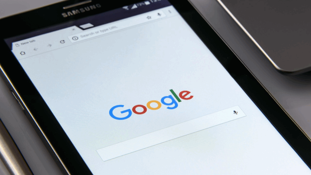
Google has revealed a redesigned version of its classic single-letter “G” logo in a delicate yet noticeable way adopting a new look that is more modern and sleek with the use of gradient transitions. According to The Verge, this is the first time since 2015 that Google has updated the ‘G’ logo. This is an indication of more sweeping changes in the company’s visual identity and design direction.
A New Look for the Google Logo
The revised logo retains Google’s classic color scheme blue, red, yellow and green but now has a more blended, smooth look due to gradient shading. The Verge reports that the new look not only updates the logo but also fits with Google’s increasing focus on artificial intelligence. This is particularly since the launch of its Gemini AI assistant and surrounding AI-based features.
A New Look for the Google Logo
The new ‘G’ was initially seen in beta releases of the Google Search app on Android and iOS. It should roll out more broadly across platforms soon. Although the alteration might look minor at first glance, it’s a big change given how infrequently Google updates such a well-known aspect of its brand.
Possible Changes to Other Google Services
As The Verge points out, this new logo design may be the first step towards a larger visual refresh. While Google has not officially announced changes to its other product logos, the new design approach may soon be applied to other services like Chrome, Gmail and Maps leading to an overall more united and consistent brand experience.
More Than Just a Design Change
This rebranding initiative highlights the way that even small visual shifts can be signals of strategic shifts at large tech firms. Google’s use of gradients to update its logo not only enhances artistic appeal but also indicates the firm’s continued evolution into a more AI-driven, future-oriented brand.
In a world where perception is everything and branding is king even the tiniest tweak can say a lot about what priorities a company is shifting towards.